 global temperature change (1850-2021) from #ShowYourStripes I am close to celebrate 32 years on this planet and for this occasion I decided it was time to take a close look at the climate changes that have occurred since, seeing what we experienced as gen-Yers (or millennials) around the globe (should you feel left out you can use this calculator - up to 2019) For this little exercise, I decided to create my own climate stripes (just because, as a good stubborn Aries, I don't necessary trust what's on the 'web') using the global anomalies data provided by the Met Office Hadley Centre observatory and re-making some 'climate stripes' with ggplot in R (some tutorials available - like this one - if you are inclined to try,). The reference period to which the 'anomaly' refer to is the previous 30 years, which one could consider the temperature experienced by our parents' generation... 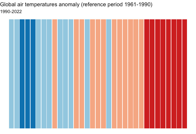 What this shows is the temperature anomalies, in dark blue < 0.25 °C , light blue < 0.5 °C, orange < 0.75°C and red > 0.75°C 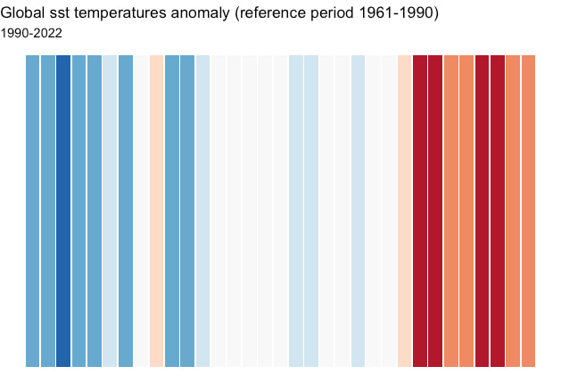 And since I am really interested about all that happens in the water realm, i decided to also repeat the exercise for the global SST data, with a similar colour gradient (darker blu to white is < 0.5°C oranges to red is 0.5-0.8°C)..
Which means that, globally, we are already experiencing a world nearly 1°C warmer than that our parents.... In case you didn't already heard it or seen it, or maybe you think it's all 'fuff'... i'd recommend you to go play with some data (can be fun) - they are all out in the open-access realm.... And just to add some data of the 'forcings' : Carbon dioxide(annual means) in the atmosphere (ppm): 1960: 316, 1990: 354, 2021:416.45 Global methane (annual means, ppb) 1990:1714, 2021: 1890 I don't want to be catastrophistic, but it's time to really stop being ostrichs and pull our heads above the sand, moving the changes for real...
0 Comments
Leave a Reply. |
Disclaimer: some posts may contain affiliate links. At no extra costs to you, buying through the link will help me in this blogging journey!
Archives
January 2023
Categories
All
|
 RSS Feed
Photos used under Creative Commons from doustpauline of > \whatwhenwhere/ <all behind., R'lyeh Imaging, Casey Hugelfink, Eric Tessmer, Honolulu Hawaii, marcoverch, shixart1985, Pascal Volk, ericcooper3, shixart1985, Rennett Stowe, romanboed, Free Public Domain Illustrations by rawpixel, Double--M, shixart1985, Ewan-M, focusonmore.com, Bennilover, dsgetch
